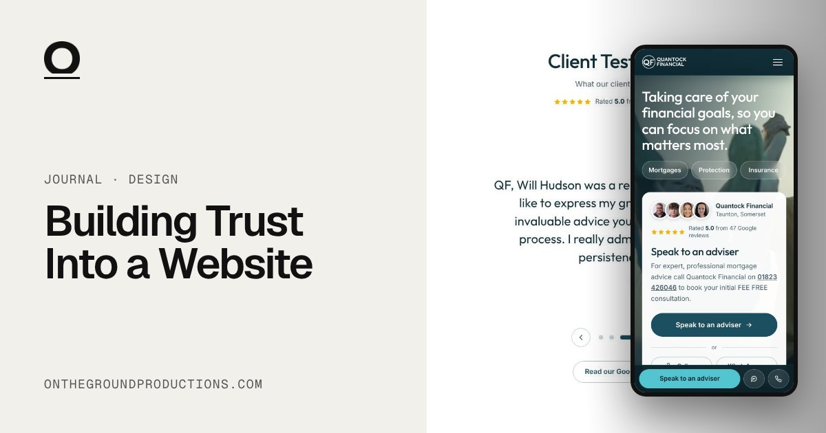
In short
- Show the real people behind the business.
- Make contact one tap away on every page.
- Be open about fees, and help people work out where they stand.
- Keep the design calm and clear.
Some businesses ask people for a lot of trust. A mortgage adviser. A letting agent. Anyone deciding who to hand their savings or their home to.
A website can’t create that trust on its own. It can make it much easier to give, and that comes down to specifics.
Here’s what we focus on.
Show the real people
Stock photos of smiling strangers don’t tell you anything. Real faces do.
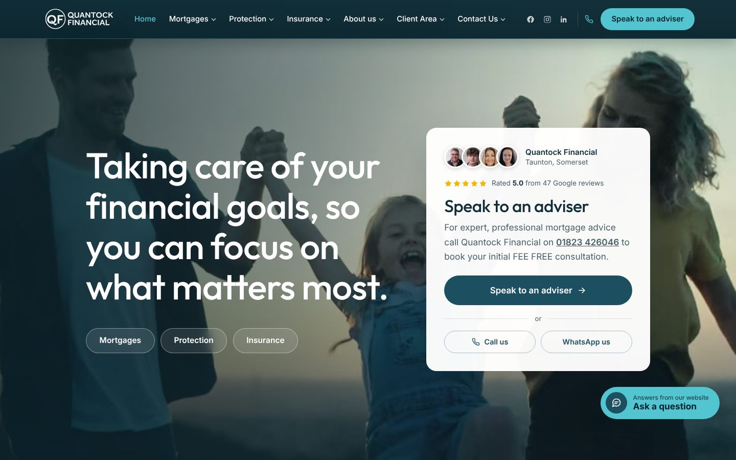
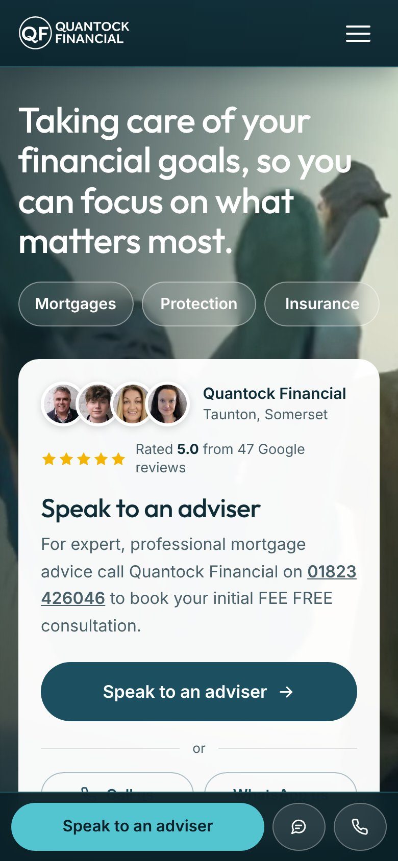
Put the people visitors will actually speak to near the top of the homepage, with genuine reviews beside them. Visitors can see who they’ll be dealing with before they scroll.
Make contact effortless
When someone is ready to talk, nothing should get in the way. Call, message and booking buttons should be one tap away on every page, especially on a phone.
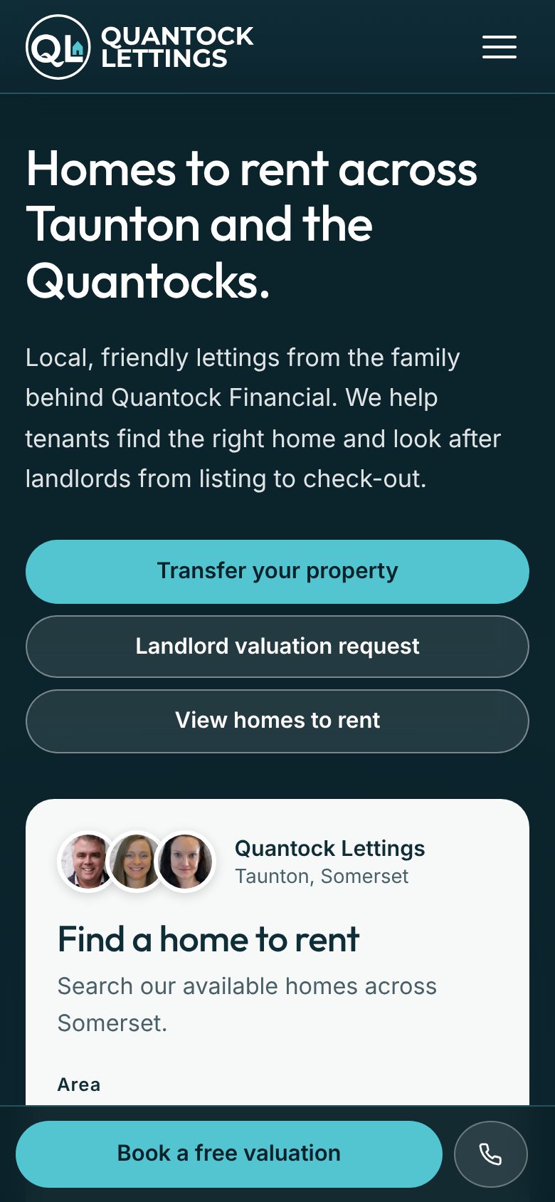
For an adviser, that might be a call or WhatsApp button that’s always there. For a letting agent, a “Book a valuation” button that follows landlords down the page.
Be open about the details
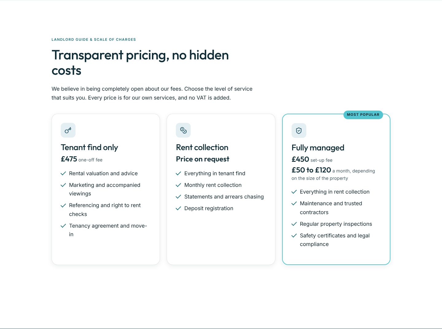
Fees are where a lot of people get nervous. Where you can, put them on the page, with no hidden costs. People can see what they’ll pay before they pick up the phone.
Help people work out where they stand
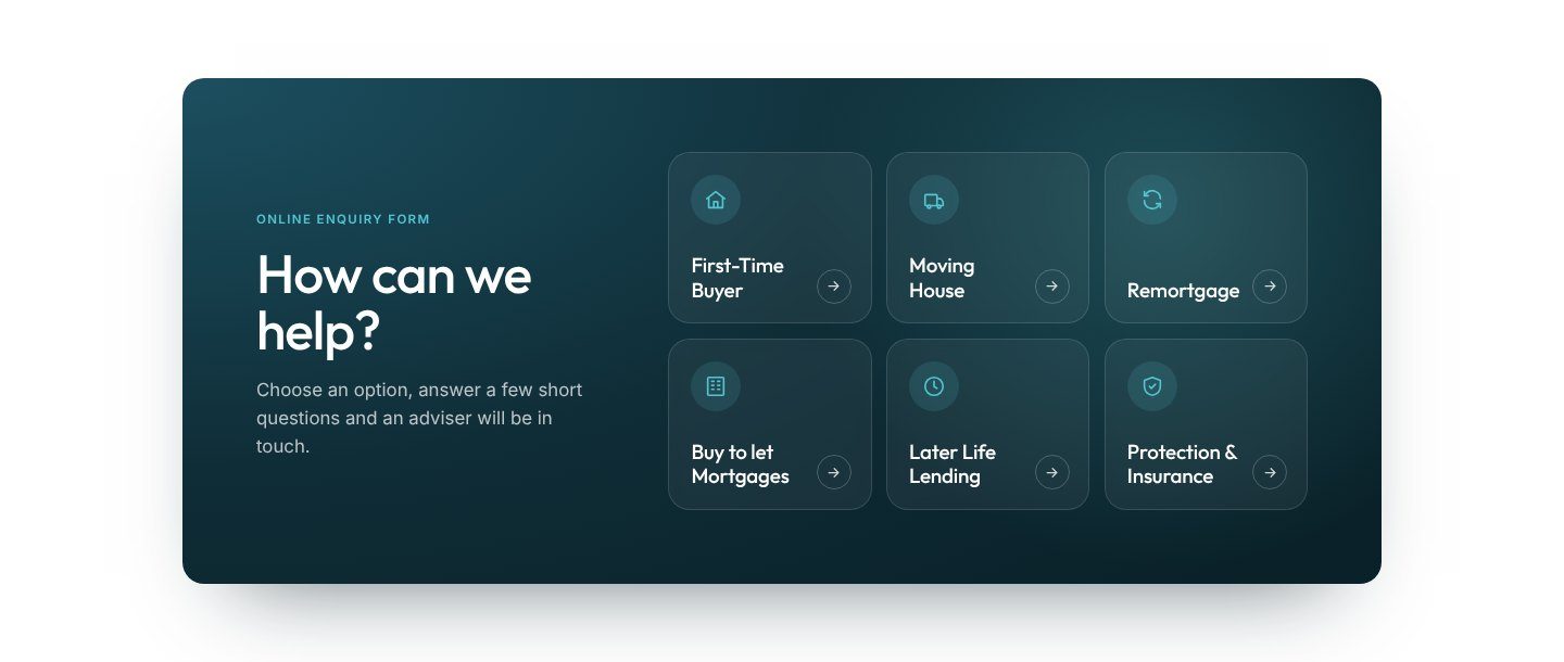
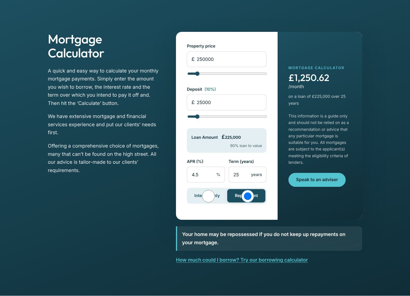
Most people arrive with a question, and they’re not always sure which one. A simple finder or a calculator lets visitors get their bearings first, before they speak to anyone.
An assistant that answers questions from the site’s own content can help too, for anyone who’d rather ask than browse.
Keep it calm
Design does a lot of the work here. A restrained palette, real photography and a clear route into each service. Money and home decisions matter, so the site should feel calm and clear.
We couldn’t be happier with the new website Marcus built for us. His attention to detail is phenomenal, and the finished site is way beyond what we originally expected.